In 2025, I hired a designer to build a sales page for a premium wristwatch I am selling. I gave him a generous budget, approved a beautiful design, and launched the campaign feeling confident. Within the first week, my phone would not stop ringing, but not with sales. Buyers were calling to ask basic questions the page should have already answered.
The page looked stunning. It had animations, multiple sections, beautiful product photography. But it was so packed with ideas, features, specifications, brand history, and comparison charts that visitors got overwhelmed instead of convinced. They called me because the page failed to do its one job: make the decision to buy feel obvious.
That experience taught me the difference between a sales page that looks impressive and a sales page that actually converts. That’s why in this article, I am going to reveal to you exactly how to write a sales page that converts with eight real examples you can model. Let’s get started.
What Is a Sales Page?
A sales page is a single web page dedicated entirely to selling one specific product or service. Unlike a general landing page that might collect an email or drive a click-through, a sales page exists for one purpose only, which is to take a visitor from curiosity to purchase in a single sitting, without them needing to contact you, ask questions, or think it over.
A strong sales page does the work of a skilled salesperson. It identifies the buyer’s problem, builds desire for the solution, removes every objection, and closes the sale. And these are all done through carefully structured words and visuals on one page.
Sales Page vs Landing Page: What Is the Difference?
These two terms are often used interchangeably, but understanding the distinction sharpens how you write each one.
A landing page can serve many different goals, such as collecting an email, registering for a webinar, generating a click-through to another page, or making a sale. It is the broader category.
A sales page is a specific type of landing page with one job only, which is closing a sale directly on that page. Sales pages are typically longer, more detailed, and more persuasion-heavy than other landing page types because they must do all the convincing work that a salesperson would normally do across multiple conversations.
Now, if a landing page asks “will you take this small first step?”, a sales page asks “will you buy this right now?”. The second question requires significantly more trust-building, objection-handling, and emotional persuasion within the same page.
For higher-priced products like the wristwatch I mentioned, or any premium digital product, course, or service, your sales page needs to work harder than a simple landing page would for a $5 product.
How to Write a Sales Page That Converts
Here is the exact structure I now use for every sales page I write, refined directly from the mistakes of that wristwatch campaign.
1. One clear headline and not five competing ideas
The biggest mistake in my failed wristwatch page was trying to communicate everything at once, like the craftsmanship, the brand heritage, the warranty, the price, the materials. Visitors did not know what to focus on. Your headline must communicate one single, powerful promise.
Weak: “Premium Swiss-Inspired Wristwatches With Sapphire Crystal Glass, Lifetime Warranty, and Free Shipping”
Strong: “The Watch That Makes You Look Successful Before You Say a Word”
2. Identify the specific buyer and their specific problem
Speak directly to who this product is for and what frustration brought them to your page. “You have outgrown the watches you used to wear in your twenties. You want something that reflects where you are now, without paying luxury brand markup for a logo.”
3. Present your product as the solution very clearly, once
State exactly what you are selling, in plain language, early in the page. Do not bury the actual offer under layers of storytelling before the visitor understands what they are looking at.
4. Use benefit-driven bullet points, not specification lists
This was my designer’s biggest error. The page listed specifications (41mm case, sapphire crystal, 100m water resistance) without translating any of it into what that meant for the buyer. “Water resistant enough to wear while swimming, washing your hands, or caught in the rain, without a second thought” sells far better than “100m water resistance.”
5. Build desire with sensory, specific language
Help the reader imagine owning and using the product. “Imagine the moment you check the time in a meeting and someone asks where you got it.”
6. Address objections directly and honestly
Every product has a hesitation point. Price, durability, authenticity, delivery time. Name it and answer it before the visitor has to ask. This single change would have eliminated most of the confused phone calls I received.
7. Include social proof close to your call to action
Testimonials, reviews, or trust badges placed near your buy button reduce last-second hesitation at exactly the moment a buyer is deciding.
8. One clear call to action, repeated consistently
Every section of your page should funnel toward the same single action. Do not offer multiple competing options — “Buy Now,” “Learn More,” “Contact Us” on the same page. Pick one goal and repeat it.
9. Close with urgency and a final reassurance
End your page with a clear final push, which is a limited offer, a guarantee, or a simple reassurance like “Secure checkout. Ships within 48 hours.”
Common Mistakes People Make When Writing a Sales Page
Trying to say everything at once: This was my exact mistake. A sales page is not the place to communicate every feature, every detail, and every piece of brand history. Pick the most persuasive angle and build the entire page around it.
Read, How to Write Sales Emails That Convert — Complete Guide With Templates and Real Examples
Writing for yourself instead of the buyer: Business owners often write sales pages describing what they are proud of rather than what the buyer actually cares about.
No clear single call to action: Multiple competing buttons confuse visitors about what to do next, and a confused visitor does not buy.
Ignoring mobile design: Most traffic from ads arrives on a phone. A sales page that looks beautiful on desktop but is unreadable on mobile loses the majority of potential buyers.
Skipping objection handling: If you do not address the hesitation a buyer feels, they leave the page to “think about it” and most never return.
Burying the price or making it hard to find: Hiding pricing creates suspicion rather than curiosity. State it clearly once the value has been built.
8 Real Sales Page Examples and What Makes Them Work
1. The Problem-Agitate-Solve Structure
Opens with the buyer’s pain, makes them feel the cost of inaction, then presents the product as relief. Common in health, finance, and self-improvement products. Works because it builds emotional urgency before pitching.
2. The Story-Based Sales Page
Opens with a personal story, often the founder’s own struggle before transitioning into the product. Builds trust through vulnerability and relatability. Common for personal brand products and coaching services.
3. The Comparison Sales Page
Directly compares the product against the alternative, like “the old way vs the new way.” This is effective for products entering a market with existing competitor habits to break.
4. The Demonstration Sales Page
Heavy use of video or step-by-step visuals showing the product in action. Common for physical products and software tools where seeing the product solves doubt faster than reading about it.
5. The Authority-Led Sales Page
Leads with credentials, results, and expertise before the offer. Common for high-ticket coaching, courses, and consulting services where trust in the seller matters more than the product description itself.
6. The Minimalist Sales Page
Short, focused, with one image, one headline, and one button. Works for impulse-buy digital products at low price points where overthinking would kill the sale.
7. The Bundle Sales Page
Presents multiple related products together with a clear discount framing like “Get all three for the price of one.” This works best when trying to increase the average order value on digital product stores.
8. The Urgency-Driven Launch Page
Built around a countdown timer, limited bonus, or closing cart date. Common for course launches and limited product drops where genuine scarcity drives faster decisions.
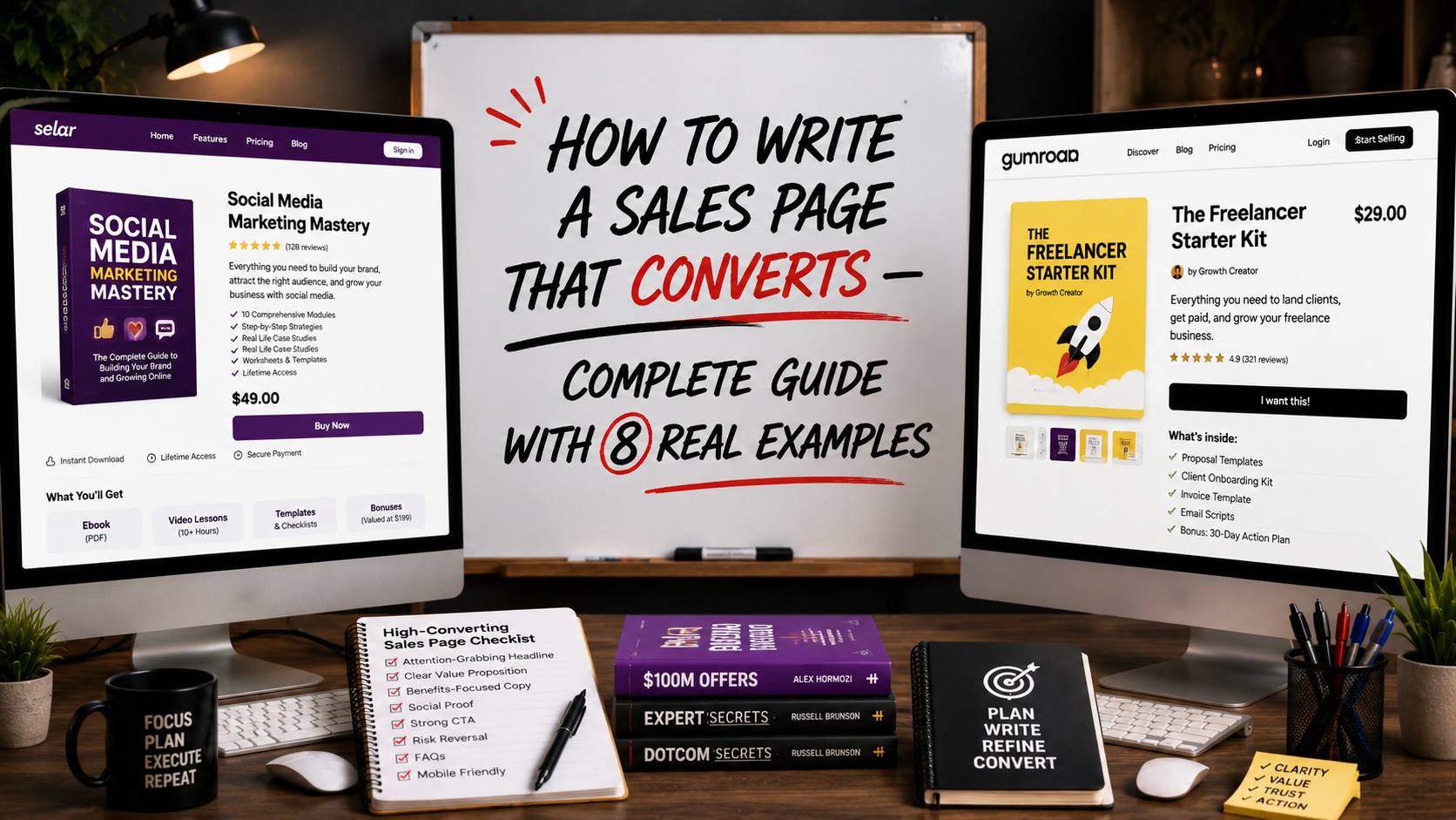
For most digital product sellers reading this, the Problem-Agitate-Solve structure combined with Story-Based elements tends to convert best for products in the $5 to $50 range, which covers most eBooks and digital products sold on Selar and Gumroad. Now that you know the type of sales page you need for your product or services, let me walk you through some templates you can use.
Sales Page Templates You Can Use
Here is a simplified template structure you can adapt for almost any product:
Headline: [The single biggest outcome your product delivers]
Subheadline: [Who this is for + the objection removed]
Opening paragraph: [The problem the buyer is currently experiencing]
Transition: [Introduce your product as the answer]
What’s included: [Clear, simple description of the product]
Benefits (3-5 bullet points): [Outcomes, not features]
Social proof: [One or two testimonials]
Objection handling: [Address the top 2 hesitations directly]
Price and offer: [Clear pricing, any bonus or guarantee]
Call to action button: [Repeated 3 times throughout the page]
Final reassurance: [Security, delivery, or guarantee statement]
This template works whether you are selling a $5 prompt pack or a $300 coaching package. Only the depth and tone will change based on price point.
Do You Need a Domain for a Sales Page?
No — not necessarily. If you are selling a digital product on Selar or Gumroad, these platforms provide a built-in sales page on their own domain, meaning you can launch and start selling within an hour without owning any website at all.
Read, What Is a Landing Page? How to Build Pages That Turn Visitors Into Buyers (With Real Examples)
However, if you want full control over design, branding, and tracking, or if you are selling a higher-ticket product or service, then having your own domain with a tool like Carrd, WordPress, or Shopify gives you more flexibility and a more professional appearance, particularly for premium products like the wristwatch example in this article.
How Long Should a Sales Page Be?
There is no universal answer. The right length depends on your price point and the amount of trust required to convert a stranger into a buyer.
Low-priced digital products ($5 to $30): 400 to 800 words is often sufficient. The decision is low-risk and visitors do not need extensive convincing.
Mid-priced products and services ($30 to $200): 800 to 1,500 words allows enough room for proper objection handling and benefit communication.
High-ticket products and services ($200+): 1,500 to 3,000+ words is common because higher-priced decisions require significantly more trust-building, social proof, and risk reversal before a stranger commits.
The major thing to bear in mind is this: a sales page should be as long as it needs to be, to fully answer every objection a buyer has and not one word longer.
How Much Does It Cost to Build a Sales Page?
The cost of building a sales page depends on your budget;
Free options: Selar and Gumroad provide built-in sales pages at no extra cost beyond their standard transaction fees. This is ideal for digital product sellers starting out.
Low-cost options: Carrd costs as little as $19 per year for a simple, professional single-page site.
Mid-range options: WordPress with a page builder plugin like Elementor costs $5 to $15 per month for hosting plus a one-time or annual fee for premium plugin features.
Custom-built options: Hiring a designer, as I did for the wristwatch project, can range from $80 to $500+ depending on complexity, but as my experience showed, a beautiful design without strategic copywriting structure will not guarantee conversions.
Best Sales Page Builders to Use
Selar and Gumroad: They are the best for a digital product creator who wants the fastest path to a live sales page with built-in payment processing
Carrd: best for simple, affordable, single-page sales pages with design flexibility
Shopify: best for ecommerce sellers who need sales pages integrated directly into their product catalog and checkout flow
WordPress with Elementor: best for creators who already have a domain and want full design control under their own brand
ClickFunnels: best for sellers running complex, multi-step sales funnels with upsells and order bumps, though it comes at a higher monthly cost
How Many Sales Pages Should You Have?
Generally, I prefer one sales page per product or offer. So, you dont need to create one general page trying to sell multiple products simultaneously. This only ends up confusing your buyers, which reduces conversion for every product on the page.
If you sell multiple digital products, each one deserves its own dedicated sales page optimized for that specific offer, that specific buyer, and that specific objection set. You can link between them, but each page should function as a complete, standalone sales conversation.
Your Sales Page Might Be the Reason You Are Not Making Sales
If you are running ads, getting clicks, generating landing page views but seeing no purchases, the problem is rarely the ad itself. It is almost always the page the ad sends people to.
So, before you increase your ad budget, blame your product, or question your pricing, go back and read your sales page as if you were a stranger seeing it for the first time. Is the headline clear? Is the offer obvious within the first few seconds? Are objections addressed? Is there one clear thing to do next?
I learned this the hard way with a wristwatch campaign that should have sold itself. Do not make the same mistake I made.
Frequently Asked Questions
What is the difference between a sales page and a product description?
A product description is typically shorter and lives within a larger ecommerce catalog page alongside other products. A sales page is a dedicated, standalone page built entirely around persuading the visitor to buy one specific product, with significantly more depth in storytelling, objection handling, and social proof.
Should I include a video on my sales page?
If you can produce a clear, well-lit video demonstrating your product or explaining your offer, it typically increases conversion rates significantly, particularly for physical products and services. For simple digital products, strong written copy alone is often sufficient.
Can AI write my entire sales page for me?
AI tools like Claude can produce a strong first draft when given clear information about your product, your buyer, and your objections. However, the strategic structure, the specific objection handling, and the final editing judgment should come from you. In essence, AI handles the drafting; you handle the persuasion strategy.
Now, if you want to learn how to build complete sales systems such as sales pages, ad campaigns, and digital products using AI tools? Get the AI Hustle eBook on Selar or Gumroad.
Leave a Reply